For a variety of reasons my wife recently had a full panel of PFTs (spiro+BD, lung volumes, DLCO) at a different hospital than the one I work at. I went with her and was pleased to see the technician perform the tests pleasantly, competently and thoroughly. I was able to glance at the results as the testing proceeded so I had a fairly good idea what the overall picture looked like by the time she was done.
The difficulty came later when my wife asked me to print out her results so we could go over them together. Many hospitals and medical centers have websites that let patients email their doctor, review their appointments and access their medical test results. They go by a variety of names such as MyChart, MyHealth, Patient Gateway, PatientSite, PatientConnect etc., etc. My hospital first implemented something like this over a dozen years ago so I had thought that by now they were fairly universal but conversations with a couple of friends from around the country have let me know that this isn’t really the case.
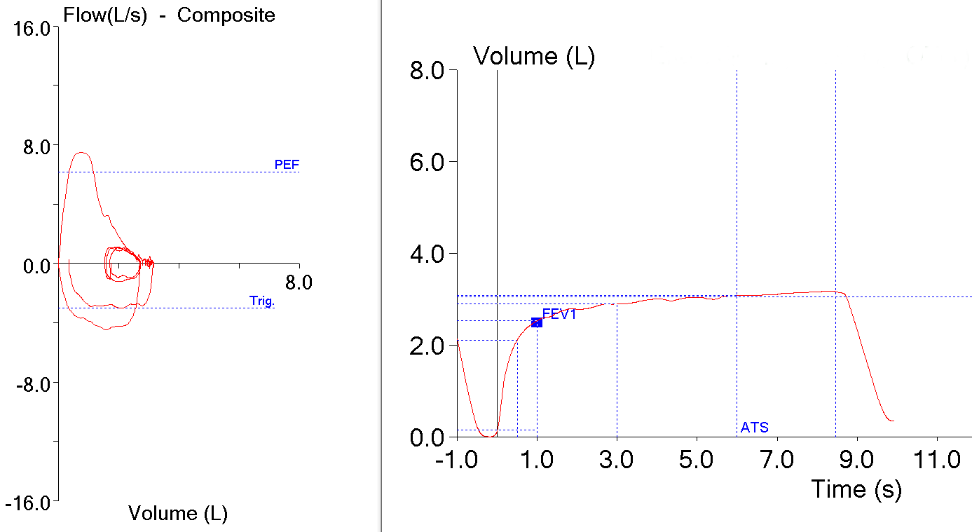
Regardless of this, the hospital where my wife had her PFTs does have a website for patients and her PFT results showed up about a week later. When I went to look at them however, I was completely taken aback. Not because the results were wrong but because they were presented in a way that made them incredibly difficult to read and understand.
Here’s the report (and yes, this is exactly what it looked like on the patient website):